When Washington, D.C., interior designer Nestor Santa-Cruz took on a condominium project for a pair of stylish sophisticates, he knew there would be challenges designing a space that would satisfy them both. One of the homeowners, we’ll call Mr. Modern, is a trained architect and owner of a construction management firm. The other, Mr. Traditional, owns a fashion boutique and favors the Baroque and opulent. Luckily, the condo, a corner unit on the second floor of a recently overhauled property, offered Santa-Cruz a dramatic backdrop for a curated selection of artwork and furniture that reflects the best of both style profiles.
“I wanted it to feel very personal,” says Santa-Cruz. “I deliberately used things that were important to each of them. I also looked at pieces they owned that could be refurbished or restored, appearing new, but also familiar.” One of those pieces graces the foyer, a mahogany console the clients owned, which Santa-Cruz had lacquered black and topped with a marble surface. The foyer also drops hints of the dueling design direction, with a vintage caned bench, a French mirror from the 1940s, and a striking contemporary artwork by Sam Gilliam. “The foyer and hall prepare you for the transition to the living room and kitchen,” he says.
Along the way, you pass though the dining room, where a round table and curvaceous Saarinen chairs offer contrasting shape to the square space and sculptural impact. Santa-Cruz took a space intended to be an office, enclosed it with steel doors, and created a den where Mr. Traditional can watch late-night television without disturbing Mr. Modern’s sleep.
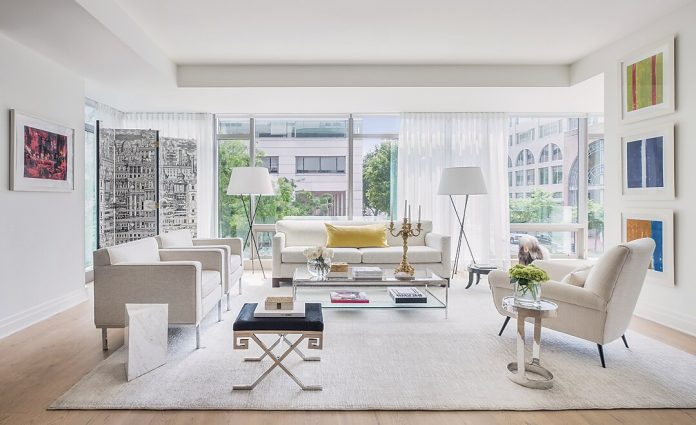
The enclosed, windowless spaces give way to a breathtaking wall of windows in the living room. A selection of art and interesting objects animate a simple, elegant seating area where 12 can gather comfortably. “We wanted to maintain a sense of calmness with simple wood floors, and the glass and the views,” says Santa-Cruz. Because of the preponderance of windows and dearth of wall, Santa-Cruz got creative. A support column, that Santa-Cruz calls free architecture, became a focal point with a triptych of paintings hung vertically. On the opposite wall, a Fornasetti screen depicting a cityscape acts as a piece of art and acknowledges the historic neighborhood it overlooks. Nearby a photograph of Diana Vreelands’s famous “garden in hell” living room was spotted by Santa-Cruz and snapped up my Mr. Modern. On the coffee table, Mr. Traditional’s beloved Baroque candelabra makes its own compelling statement.

